
Here is the first of my articles on design. You’ll probably find some of these articles already online. I am just documenting some of the things I have learnt and anyone could follow the trajectory to become good designers too.
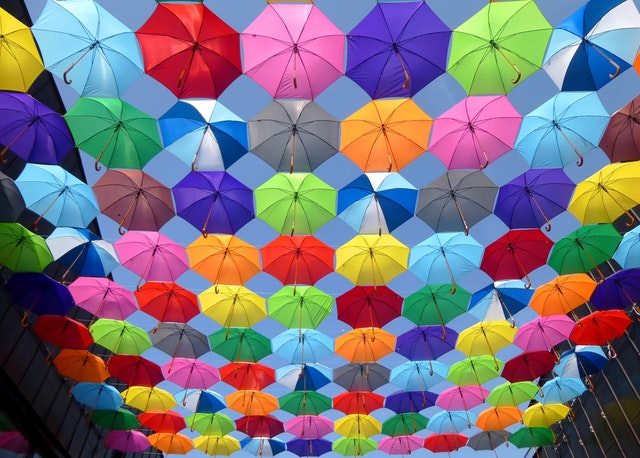
Understanding colors helps you achieve coherence in design. Colors are visual and psychological. They direct the attention of the person and help them experience a design a certain way and you want to be able to get people to pay attention to the right things. Rather than enjoy the beauty of your design, you do not want people pondering over how jarring or underwhelming your design is. This is why a good designer should learn about color and how they work together. That brings us to the first definition.
So what is Color Theory?
Color theory is a set of principles that guides designers to create cohesive color combinations. These principles help designers choose and combine colors effectively when creating color palettes. They can be represented in various forms such as color charts, color wheels, color schemes, color triangles etc.
There had been several attempts to define color relationships in the past. One of such was Johann Wolfgang van Goethe’s book titled Theory of Color. Van Goethe’s book had an equilateral color triangle which contained nine colors, defining that color relationships were categorized by emotions. Before him, Sir Isaac Newton has presented a color theory that was a spectrum from splitting white light into red, orange, green, blue, indigo and violet. Others include Nobel prize winning chemist, Wilhelm Oswald, through his book, The Color Primer ; Louis Prang who wrote the book Theory of Color and popularized the primary colors in the form of red, blue, and yellow.
Categories in Color Theory
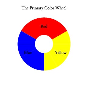
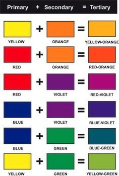
- Primary Colors– These are yellow, red and blue. They are the fundamental colors that combine to form other colors.
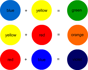
2. Secondary Colors – When you combine each of the primary colors with another primary color, what you get are secondary colors. The secondary colors are green, orange, and purple.
Tertiary Colors – These are the colors you get when you combine each primary color with each secondary color. The results you get are red-orange, red-purple, blue-green, blue-purple, yellow-orange, yellow-green.
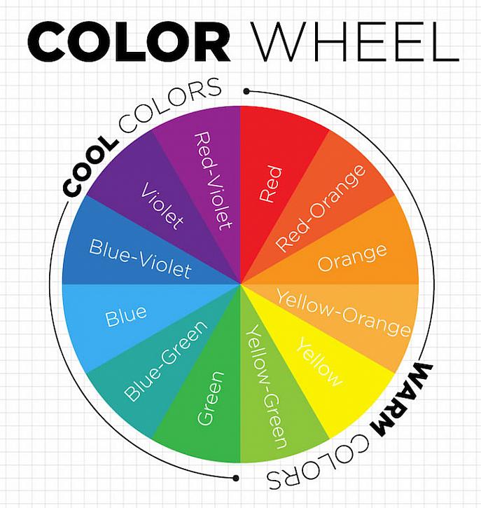
Tertiary Colors – colors next to each other on the color wheel
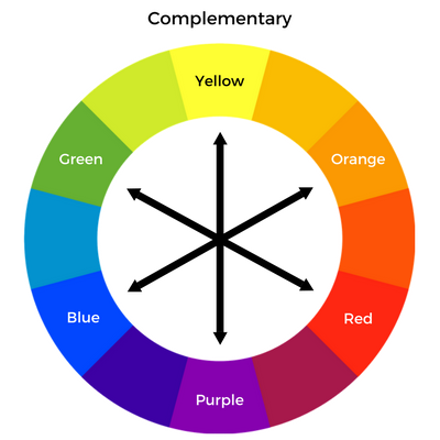
Complementary Colors – These are colors that are opposite one another in the color spectrum. E.g Orange and Blue.
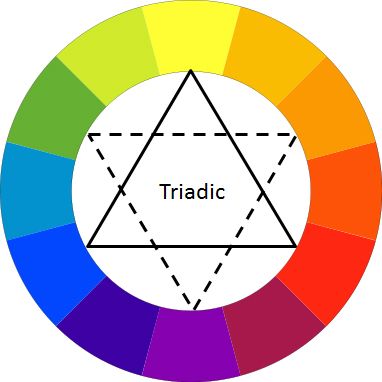
Triadic Colors – These are three colors that are equidistant from one another in the color wheel. E.g. Red, blue, yellow.
Analogous Colors – These are two or three colors beside one another on the color wheel. They are usually easy on the eye when used together. E.g. Blue, green-blue and green.

Split Complementary Colors – These are three colors where the one color is directly opposite the two colors spaced out by one color. E.g. Red, green and yellow.
Double Complimentary Colors (Tetradic) – These are four colors consisting of two pairs of colors complementary to another.
Monochromatic Colors – This is a colors made of the shades and tints of one color.
Square Color Scheme – These are four colors evenly spaced from one another on the color wheel.
Properties of Color
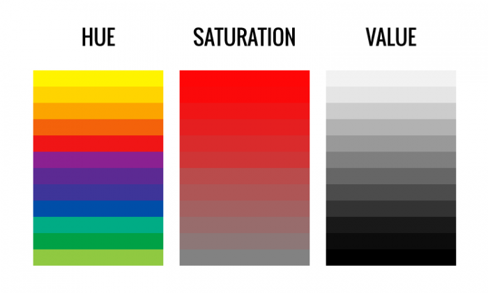
HUE
A hue is the name of a color which signifies its position on the color spectrum.
SATURATION
This refers to the intensity, chroma or purity of a color. A color that is bright is highly saturated while one that is dull is desaturated.
BRIGHTNESS
This is the degree of light or darkness in a color. It may also be described in terms of brilliance.
VALUE
This is the degree of darkness or lightness of a hue. Variations in value are used to create a focal point for the design of a picture. Contrast of value separates objects in space, while gradation of value suggests mass and contour of a contiguous surface. Gradations of value are also used to create the illusion of depth, thus producing three dimensional figures. White, black and gray are referred to values without hues.
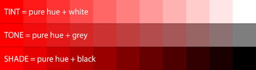
TINT
A tint is amount of white added to a color
TONE
The tone is the amount of gray added to a color.
SHADE
This is the degree of black in a color.
COLOR TEMPERATURE
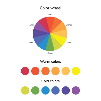
WARM COLORS
These are bright colours. They include yellow, red, red orange, orange, and red violet. Basically, the reds, yellows and oranges. These also describe the temperature of the colours.
COOL COLOURS
These are darker colors like blue, green, violet, yellow-green, blue-violet etc. Basically the blues, greens and purples. They are the other side of the color temperature.
There you go! A simple introduction to some terms in understanding how colors work together. Look forward to my next article.
Cheers